
In the world of branding and packaging design, every element serves a purpose, and colour is no exception. It’s not just about aesthetics; colour plays a crucial role in shaping consumer perception and influencing purchasing decisions. Let’s delve into the fascinating realm of colour psychology in packaging design and explore how different colour choices can evoke emotions, convey messages, and ultimately impact consumer behaviour.
The Psychology Behind Colour
Colour psychology examines how different colours affect human emotions, behaviours, and perceptions. Each colour carries its own associations and meanings, deeply ingrained in cultural, societal, and personal contexts. Understanding these associations is key to leveraging colour effectively in packaging design to create desired emotional responses and convey brand messages.
Orange: Vitality and Wellness
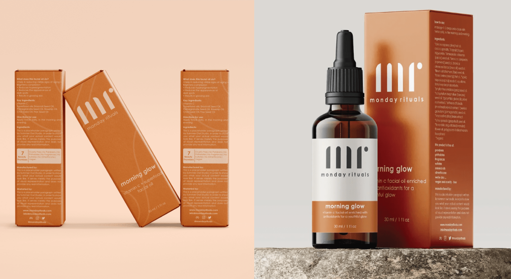
Orange is a vibrant and energetic colour associated with vitality, warmth, and wellness. In packaging design, orange can evoke a sense of rejuvenation, radiance, and self-care, making it an ideal choice for skincare and wellness products. Brands often use orange to convey a feeling of freshness, revitalization, and indulgence, particularly in industries where pampering and self-care are emphasized. The warmth of orange can create an inviting and comforting appeal, encouraging consumers to engage in moments of personal rejuvenation and well-being. Using orange in Monday Rituals’ brand identity and packaging design helped infuse the visual identity with a sense of vitality and wellness, perfectly reflecting the brand’s mission to rejuvenate and indulge consumers in moments of self-care and well-being.
Blue: Trust and Serenity
Blue is a calming and trustworthy color associated with reliability, trustworthiness, and professionalism. In packaging design, blue can instill a sense of confidence, security, and tranquility in consumers. Brands frequently use blue to convey reliability, integrity, and quality, particularly in industries such as healthcare, finance, and technology, where trust is paramount. Blue played a pivotal role in building the visual identity and packaging design for Vi and Ash, a wellness brand specializing in multivitamin gummies. By incorporating shades of blue into their branding, Vi and Ash communicated a sense of calm, trust, and professionalism to consumers, instilling confidence in the quality and integrity of their products. This was especially important for their Sleep+ Melatonin gummies, where the calming effects of blue perfectly complemented the product’s purpose of promoting restful sleep.

Green: Nature and Health
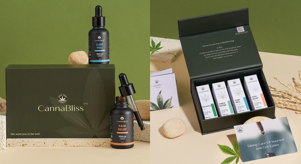
Green is closely linked to nature, growth, and health, making it an ideal choice for products associated with wellness, sustainability, and eco-friendliness. In packaging design, green can evoke feelings of freshness, vitality, and harmony with the environment. Brands often use green to communicate their commitment to natural ingredients, environmental stewardship, and holistic well-being.By incorporating green into India Hemp Organics’ branding and packaging design, we symbolized their commitment to holistic well-being and sustainability, aligning perfectly with their mission to unlock the healing potential of Cannabis sativa and offer natural products like CannaBliss Oils and Hemp Nutrition Powders.
Yellow: Optimism and Cheerfulness
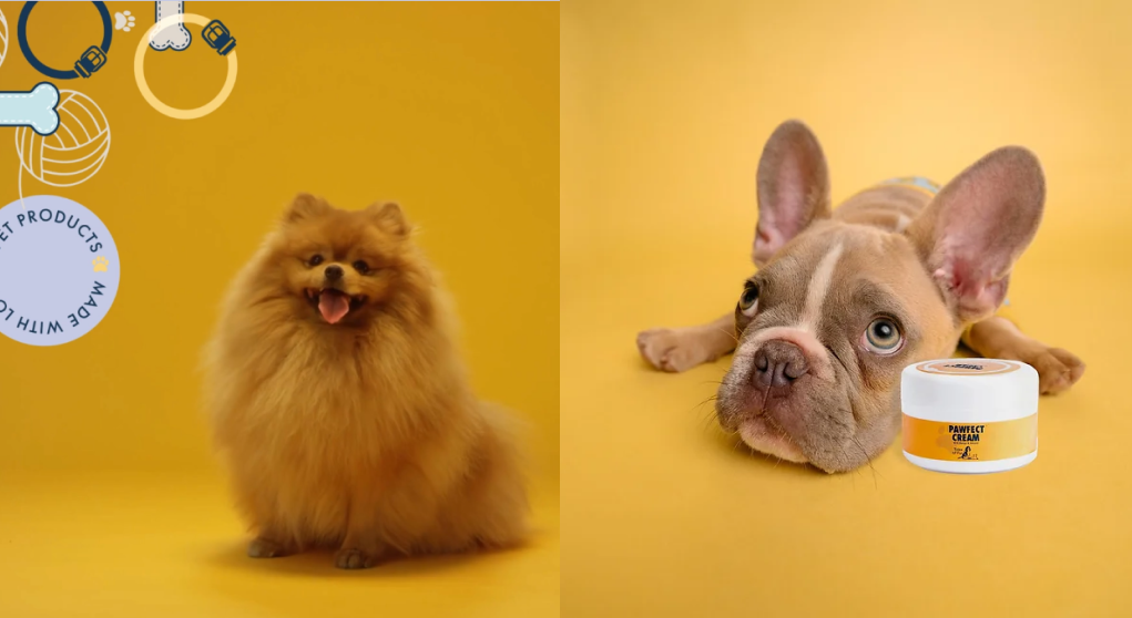
Yellow is a cheerful and optimistic colour associated with happiness, warmth, and positivity. In packaging design, yellow can evoke feelings of joy, energy, and optimism, making it an effective choice for products that aim to uplift and inspire consumers. Brands often use yellow to convey a sense of fun, playfulness, and youthfulness, particularly in industries such as food, beverages, and personal care.The incorporation of yellow in Tales of Fur’s visual identity helped elevate photographs by infusing them with a sense of optimism and cheerfulness. The vibrant hue added a lively touch to the imagery, creating a more dynamic and engaging visual experience that resonated with the brand’s mission of providing natural and uplifting grooming products for pets.
Pink: Bold and Playfulness
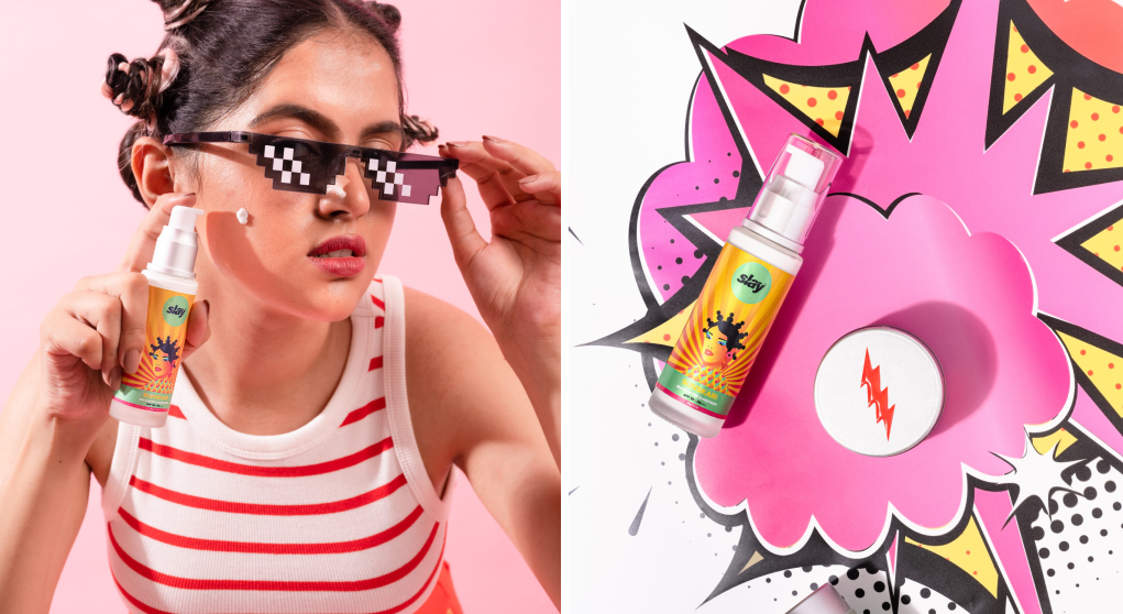
Pink is often associated with boldness, playfulness, and empowerment, making it a popular choice for products that aim to make a strong statement. In packaging design, pink can evoke feelings of confidence, creativity, and vibrancy, creating a sense of energy and allure. Brands often use pink to appeal to a dynamic audience or convey a sense of boldness and joy. By incorporating pink into Slay Cosmetics’ product photography, we infused the visuals with a sense of boldness and playfulness, aligning perfectly with the brand’s ethos of providing skincare products that prioritize science-backed, toxin-free formulas. The use of pink not only appealed to the brand’s target audience but also evoked feelings of confidence and charm, enhancing the overall allure of Slay Cosmetics’ offerings such as the UNHOLI cleanser, JORGEOUS moisturizer, SUNSKARI sunscreen, and the BORN TO SLAY set.
Colour is a powerful tool in packaging design, capable of evoking emotions, conveying messages, and influencing consumer behaviour. By understanding the psychology behind colour, brands can strategically use colour to create memorable and impactful packaging designs that resonate with their target audience, differentiate their products, and ultimately drive sales. Whether it’s the boldness of red, the trustworthiness of blue, or the freshness of green, each colour choice tells a story and shapes the consumer’s perception of the brand. So next time you’re designing packaging for your product, consider the power of colour and the message you want to convey to your audience.
At our design studio, we are experts in the psychology of colour and its application in branding. We work closely with you to understand your brand’s essence and your target audience, ensuring that the colours we choose will resonate and create the desired emotional impact. Let us partner with you to craft a visually cohesive and psychologically compelling brand experience. Together, we can make your brand stand out and leave a lasting impression on your industry and in the hearts of your customers.