
Monday Rituals
Monday Rituals, dedicated to banishing the Monday blues and jumpstarting your week with glowing and flawless skin, entrusted us to create their visual identity, logo, and packaging designs
The direction we chose was elegant yet minimalistic. When Monday Rituals reached out to us, their vision was crystal clear, a logo with unmistakable presence and packaging design that effortlessly educates buyers about their products. Taking this brief, we created a brand identity that is rooted in simplicity and trust.
Client
Monday Rituals
Category
Skincare Products
Visual Identity, Branding, Packaging, Logo Design
Our Logo Design Journey
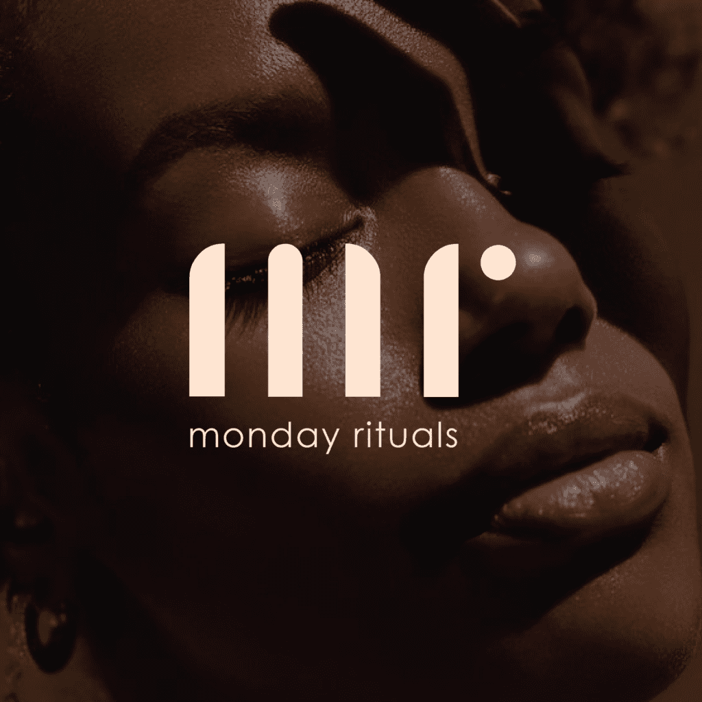
Beyond just aesthetics, a great logo acts as a visual shortcut. It can communicate your brand’s values and personality in a simple image, instantly telling your target audience who you are and what you stand for.
Monday Rituals unveils a prominently displayed stencil-like logo mark, intricately tailored solely for the brand. This distinct emblem not only captures immediate attention but also encapsulates the fundamental essence of Monday Rituals. Characterized by assertive lines and a compelling design, the logo serves as a robust visual embodiment of the brand’s steadfast dedication to excellence and originality.

Our Take on the Visual Identity and Packaging Design
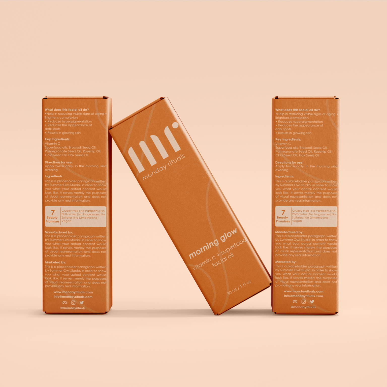
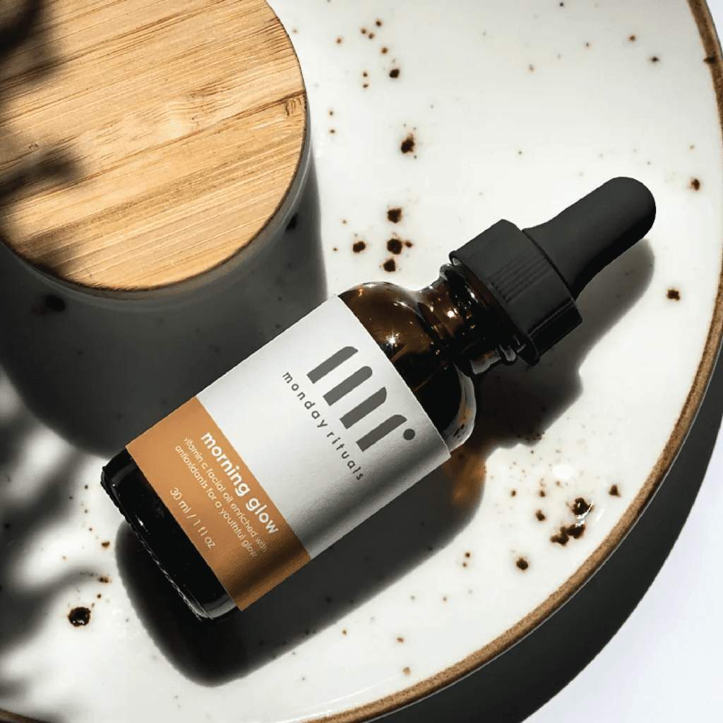
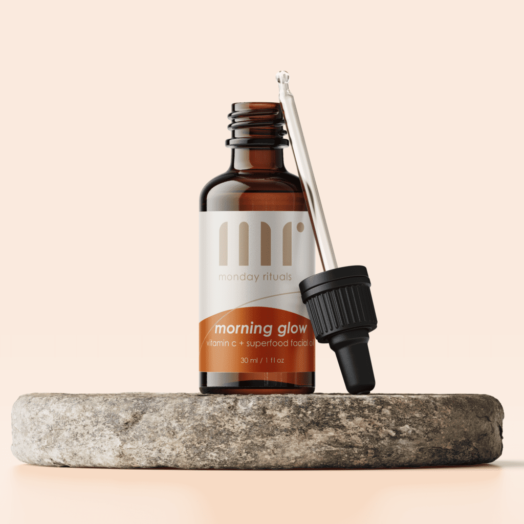
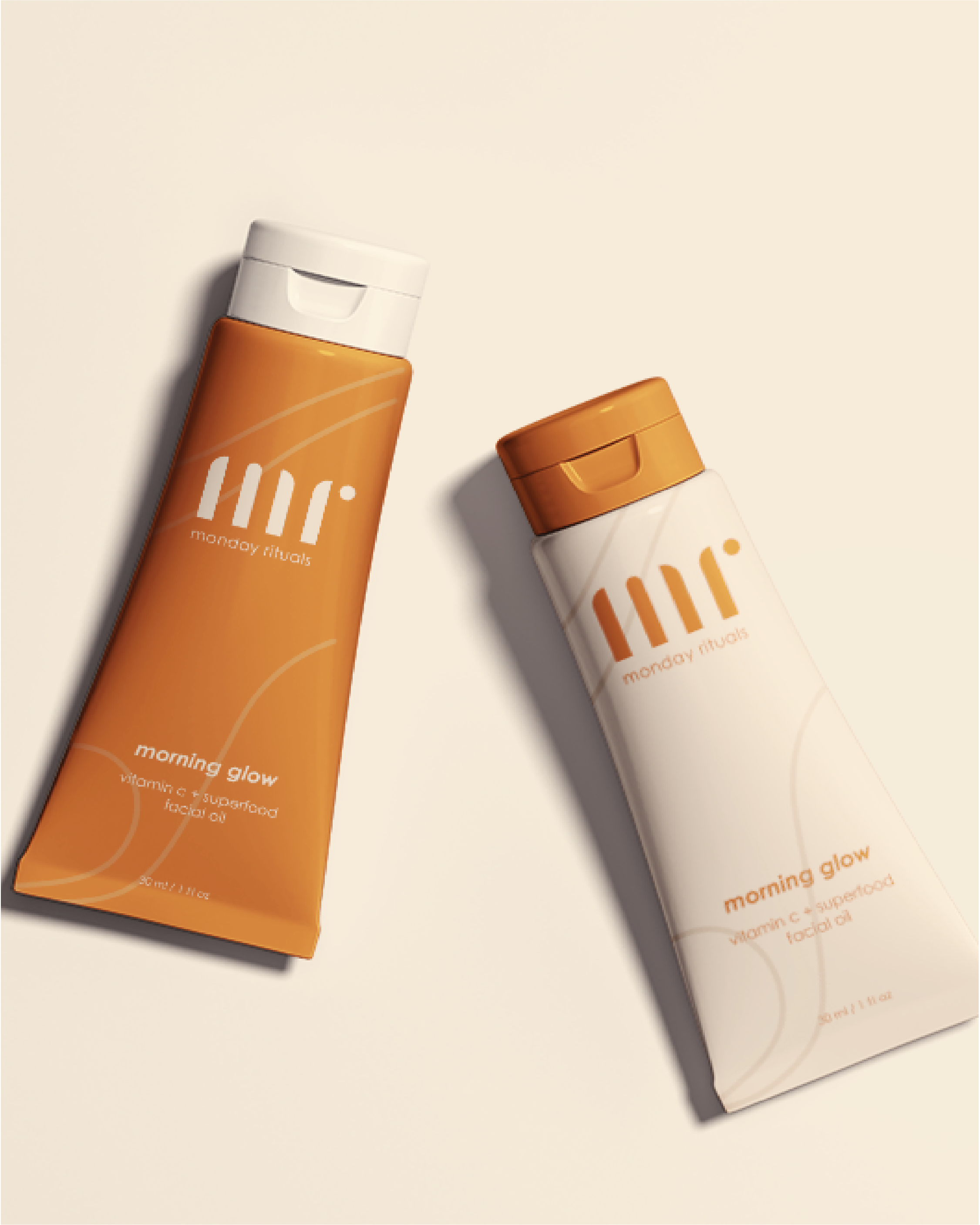
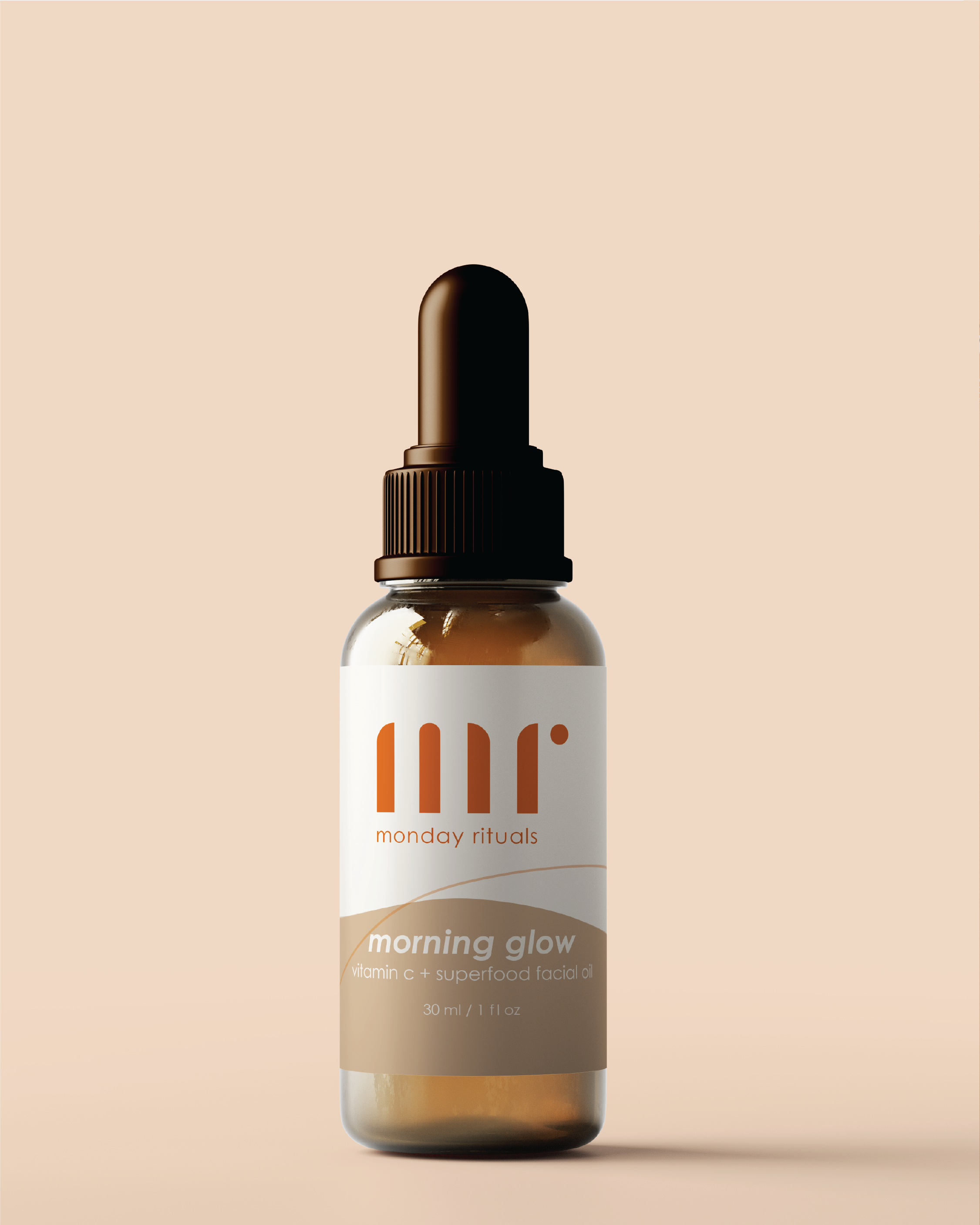
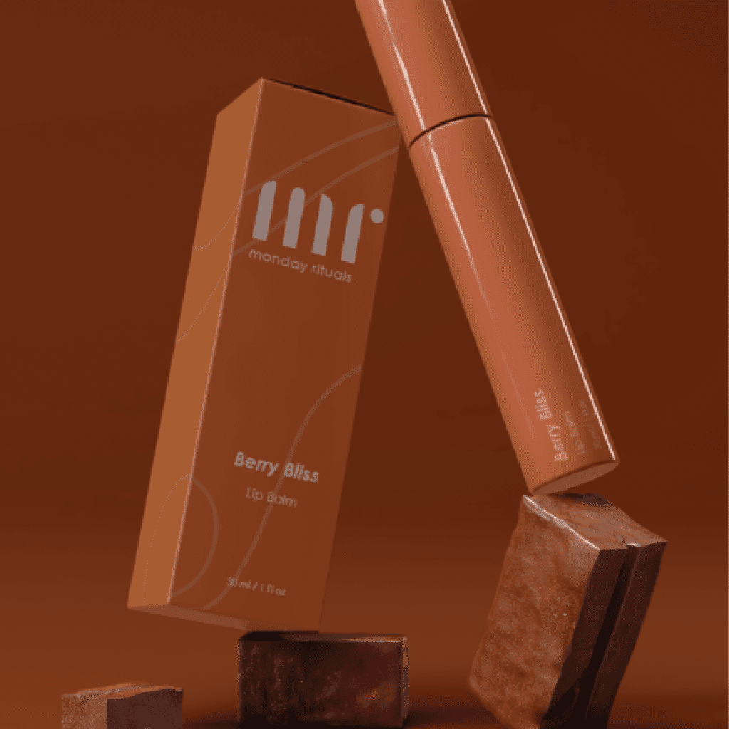
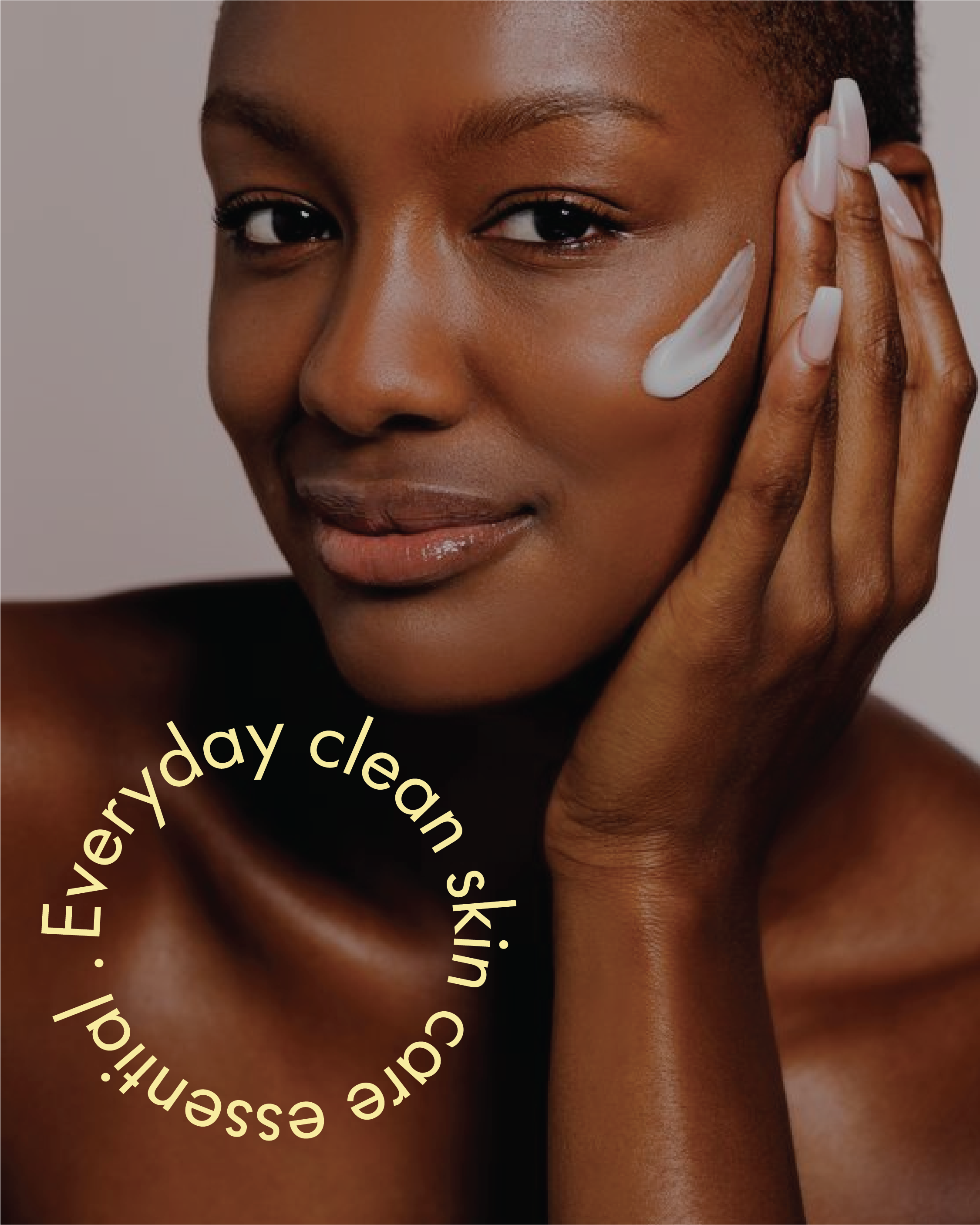
Our aim in designing Monday Rituals’ packaging design and visual identity was to create a cohesive experience that reflects the brand’s philosophy. We achieved this through a combination of elements: minimalist elegance, a touch of luxury, and calm confidence. Neutral tones dominate the design, creating a clean and sophisticated aesthetic that aligns with the brand’s commitment to simplifying your routine without sacrificing effectiveness. Subtle metallic accents or a textured finish on the packaging elevate the everyday experience, serving as a visual reminder that self-care is an investment in yourself.
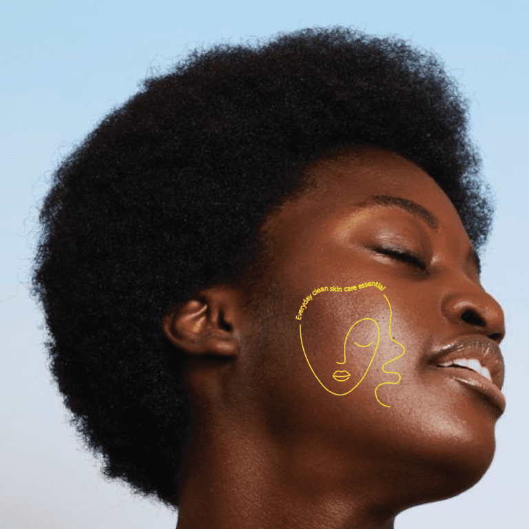
The overall feel is one of spirituality and empowerment, encouraging you to approach your week with a sense of peace and inner glow. This combination of design elements goes beyond aesthetics, visually inviting you to transform your Mondays into a self-care ritual that sets the tone for a radiant week.


We are not done yet! We also provided them with a social media guideline.
We craft visually captivating content that uses the brand’s signature minimalist elegance. This, combined with thought-provoking captions, leaves a lasting impression and positions Monday Rituals as more than just skincare, but as a key element to a confident and radiant week.

Strategy & Creative Direction: Shriya Seshadri
Lead Graphic Designer: Ayushi Ujjainiya