Unlocking the true potential of your brand involves understanding its intricate anatomy. As a graphic design studio and agency specializing in branding and packaging, we believe that a brand is a dynamic entity comprising multiple elements. Let’s dissect the anatomy of a brand:
1. Identity at the Core:
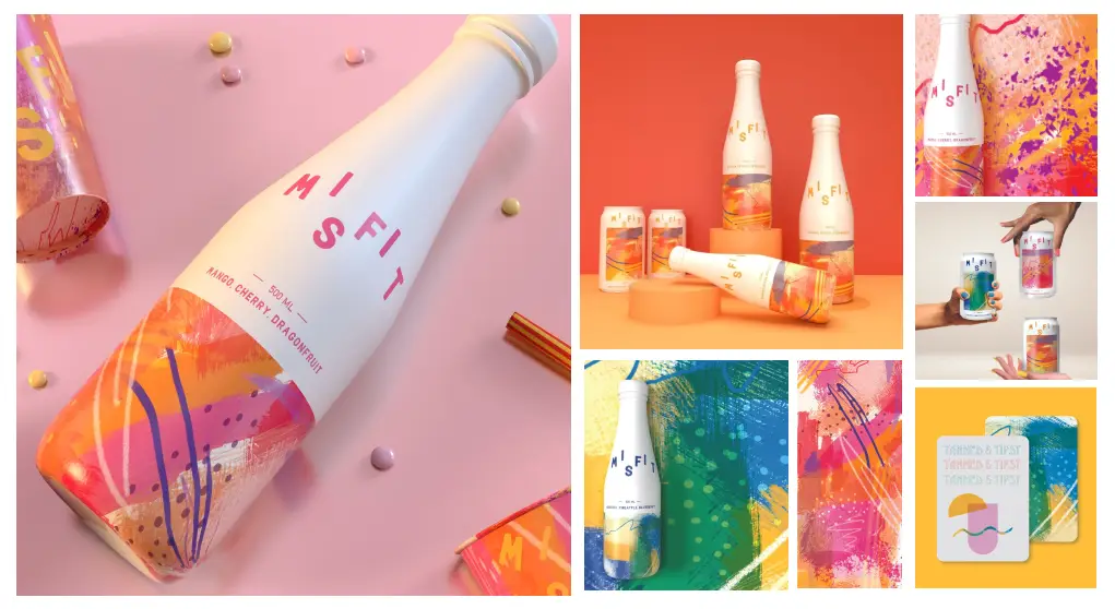
Your brand identity is the heartbeat of your business. From logos to color schemes, it encapsulates the visual elements that make your brand instantly recognizable. A cohesive identity creates a visual language that communicates your brand’s personality and values. In crafting Misfit’s brand identity, we anchored it around the core themes of celebration and diversity. The brand name itself, “Misfit,” embodies this ethos, while the logo design, tone, and packaging designs harmonize to create a unique experience that celebrates individuality and inclusivity. The packaging design for the cans and bottles reflects the concept through a sense of freedom, free spiritedness and child-like confidence through the use of different crayon, paint, and marker textures.

2. Personality and Values:
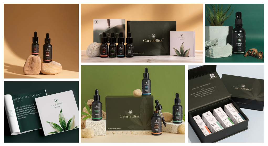
Beyond visuals, a brand possesses a distinct personality and set of values. These traits resonate with your target audience, shaping their perception of your brand. Whether it’s a commitment to sustainability or a passion for innovation, infuse your brand with values that connect on a human level. India Hemp Organics, true to its commitment to holistic health, infused its brand personality with values of simplicity, calmness, and organic authenticity. The visual identity for CannaBliss products was meticulously crafted using geometric shapes, nature-inspired photography, and harmonious colour-blocking, reflecting these core values and resonating with health-conscious consumers.

3. Storytelling Narrative:
Every brand has a story waiting to be told. Your journey, mission, and the solutions you provide form the narrative that engages and captivates your audience. Effective storytelling creates an emotional bond, making your brand more than just a product or service—it becomes an experience. With our brand Slay Cosmetics we communicated our products with a captivating story. Our vibrant, retro-modern-themed photoshoot using relatable visual elements to connect with the audience, while cleverly incorporating the brand’s empowering narrative through product placement and a touch of nostalgia.

4. Consistency as the Backbone:
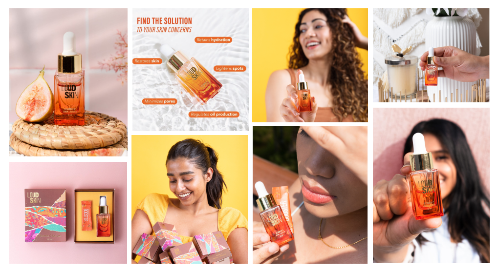
Consistency is the backbone of a strong brand. Whether it’s the packaging design or social media posts, maintaining a uniform brand voice and visual identity across all touchpoints ensures a cohesive and memorable brand experience. In the case of Loud Skin, consistency is the secret sauce. From packaging design to social media posts, we meticulously maintain a harmonious brand voice and visual identity. This uniformity ensures that every interaction with Loud Skin feels like a seamless and memorable experience.

Embark on a collaborative journey with our design experts to bring each facet of your brand’s anatomy to life. Let’s craft a visual and narrative symphony that not only speaks to your audience but leaves an enduring imprint in the competitive landscape.