Different Typefaces and What They Stand For –
In the world of graphic design, typefaces do more than simply convey words—they tell a story, evoke emotions, and communicate brand identity.
Whether you’re crafting a logo design, enhancing packaging design, or building a complete branding strategy, choosing the right typeface can make a powerful impact.
Each font style has its own unique personality and can influence how your brand is perceived by your target audience.

The Psychology Behind Typeface
Typeface psychology refers to how different fonts can influence human emotions, behaviours, and perceptions. Similar to colour psychology, typefaces convey messages that go beyond their primary function of ensuring legibility.
The shape, weight, and style of a typeface can evoke a variety of feelings, such as trustworthiness, excitement, luxury, or playfulness.
Understanding these associations is crucial for using typography effectively in graphic design, branding, logo design, and packaging design. By selecting the right typeface, you can create a stronger impact on your target audience.
Let’s explore the different typefaces and the messages they communicate.
Serif Typefaces: Traditional and Trustworthy
Serif fonts, such as Times New Roman and Georgia, are characterised by small lines or ‘serifs’ at the ends of each letter. Known for their classic and timeless appeal, these fonts are often favoured by brands that want to convey a sense of being established, reliable, and credible.
In branding, serif fonts are particularly effective for industries that value tradition and trustworthiness, such as law, finance, and education. When used in logo design, a serif font can give a company an aura of stability, making it an ideal choice for brands aiming to build trust.
For example, brands like Vogue, Burberry, and The New York Times use serif fonts to evoke a sense of authority and tradition. These fonts help communicate their long-standing reputations and commitment to reliability.


Sans-Serif Typefaces: Clean and Modern
Sans-serif fonts, such as Arial, Helvetica, and Futura, are known for their clean and straightforward appearance. These fonts lack the extra strokes (serifs) seen in more traditional typefaces, giving them a sleek and modern look.
This style creates a minimalist aesthetic, making sans-serif fonts ideal for brands that want to project a contemporary, approachable, and innovative image.
In graphic design, sans-serif typefaces are highly versatile and work well across a variety of industries. They’re especially popular in packaging design, where simplicity and clarity are key. The clean lines make it easier for customers to quickly read product details, which is essential in today’s fast-paced retail environment.
Many well-known brands use sans-serif fonts to communicate a modern and easy-to-understand message. For example, Apple, Spotify, and Nike all use sans-serif fonts in their branding, helping to emphasise their sleek, user-friendly, and forward-thinking identities.


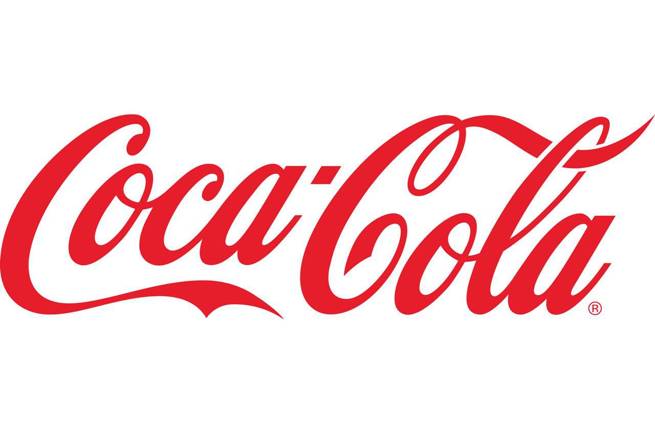
Script fonts mimic the fluidity of cursive handwriting, adding a personal and luxurious touch to a brand’s identity.
These fonts are particularly popular in industries that focus on elegance, creativity, and sophistication, such as fashion, beauty, and lifestyle branding.
When thoughtfully incorporated into logo design or packaging, script fonts can evoke emotions of warmth, exclusivity, and refinement. They can help create a sense of luxury and personal connection with the audience.
However, script fonts should be used sparingly. When overused or used at smaller sizes, they may compromise readability, making it difficult for customers to quickly absorb important information.

Display Typefaces: Bold and Unique
Display fonts are designed to stand out, often featuring decorative or stylised elements that capture attention. These typefaces are perfect for brands that want to make a bold statement and break away from conventional designs.
In branding, display fonts are frequently used to convey creativity, personality, and a sense of fun. They allow a brand to express its individuality and appeal to a more adventurous audience.
In packaging design, display fonts can turn a product’s name or logo into a focal point, helping it stand out on crowded shelves. Their striking and unique nature ensures that the product grabs attention, even from a distance. For example the Disney logo uses a playful and whimsical display font to evoke a sense of magic, creativity, and fun, making it instantly recognisable and beloved worldwide.


The Power of Typeface in Branding
Choosing the right typeface is a fundamental part of crafting a cohesive brand experience, as it shapes your brand’s personality and influences how it is perceived by your audience. Whether you’re designing a logo, website, or packaging, the typeface you select plays a crucial role in communicating your brand’s unique values and identity. At Summer Owl Studio, we recognise the emotional impact that typefaces have on branding, and we’re here to guide you through the process of selecting the perfect typeface that resonates with your brand. It’s more than just an aesthetic decision; it’s a strategic choice that can set your brand apart and create a memorable experience for your customers. Let us partner with you to craft a visually compelling brand that not only catches the eye but also connects with your target audience.