
NoFuss
NoFuss approached us with a vision to build a brand that radiates energy, inclusivity, and simplicity. We crafted a visual identity that is modern, approachable, and instantly comprehensible through their branding, packaging, and other design collateral.
The logo and packaging highlight the brand’s key features, ensuring clarity and trust at a glance. Each element emphasises quality, aligning with NoFuss’s commitment to transparency and functionality. The result is a brand identity and packaging solution that is as vibrant and straightforward as its name—NoFuss.
Client
NoFuss
Category
Health & Wellness Protein-Based Products
Branding, Website and
Packaging Design
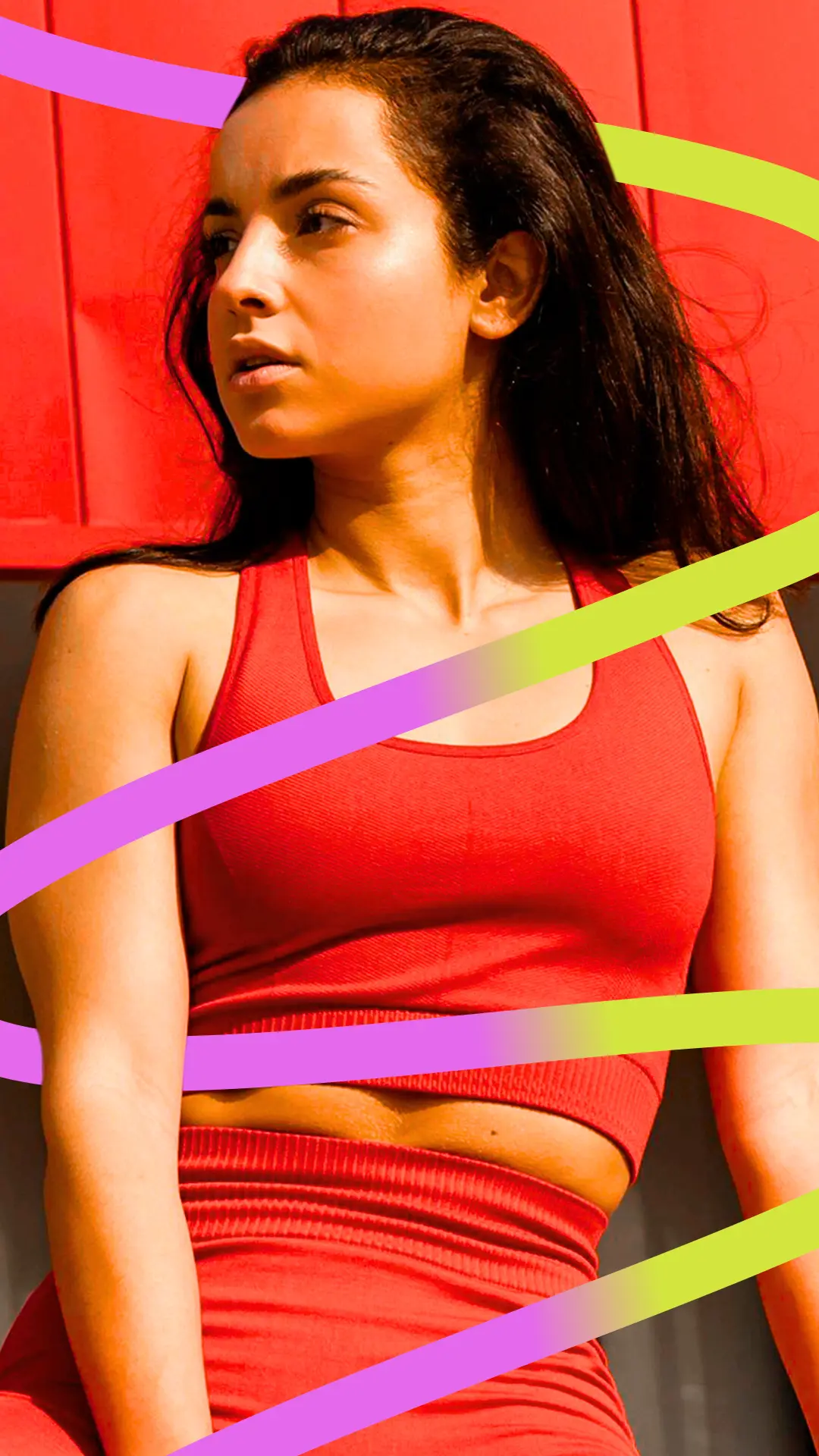
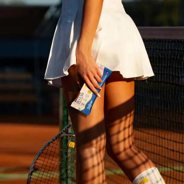
WEBSITE & SOCIAL MEDIA


Our Take on the Branding
The identity reflects the brand’s ethos of being straightforward and transparent, perfectly aligning with the name “NoFuss.” Combined with vibrant colours and clean packaging, the logo becomes a focal point that draws attention while clearly communicating the brand’s values. The NoFuss logo strikes a perfect balance between energy and simplicity, with its bold, flowing typography and clean, dynamic design. The playful yet structured type conveys an approachable and inclusive vibe.

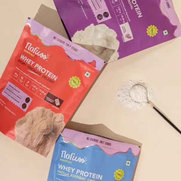
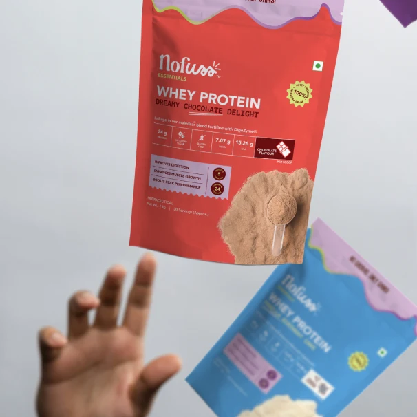
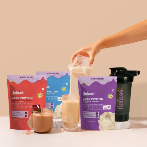
Our Take on the Packaging
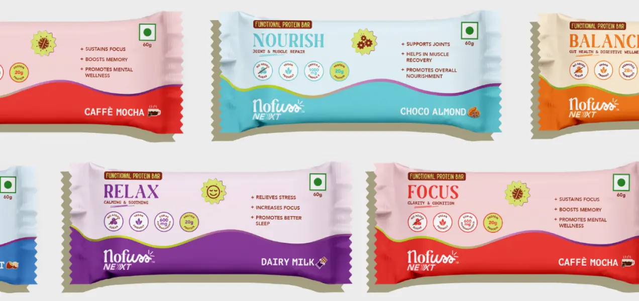
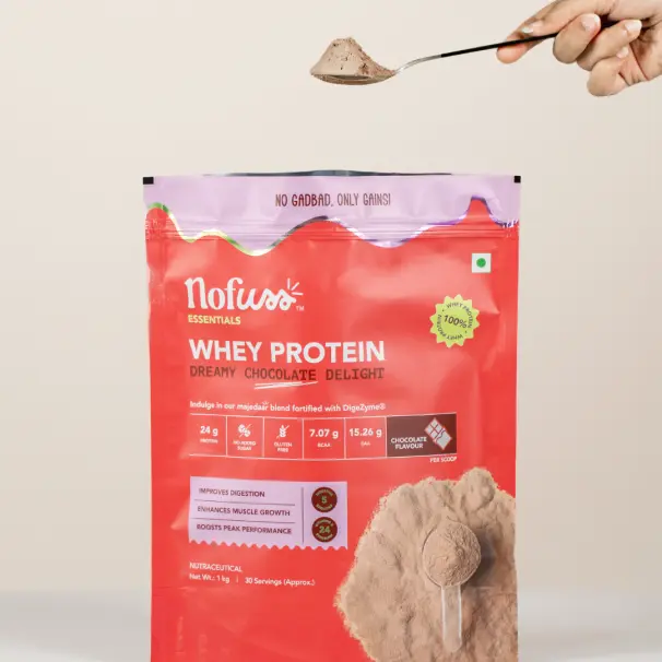
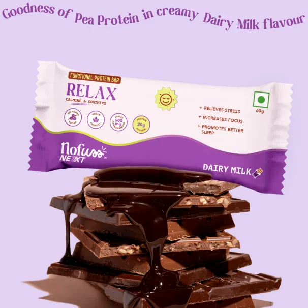
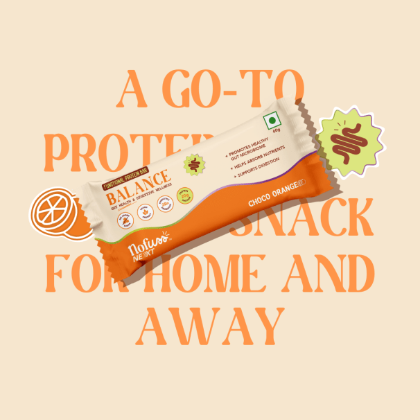
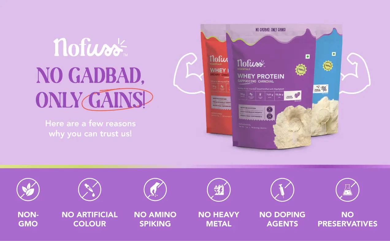
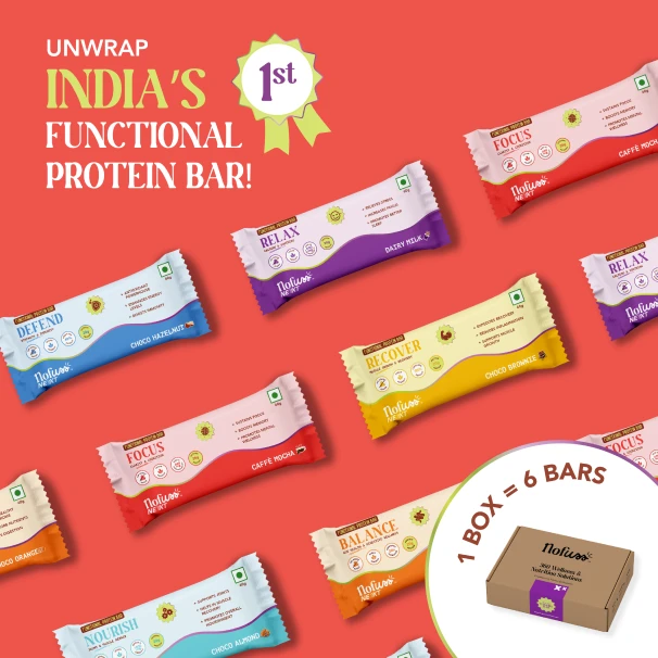
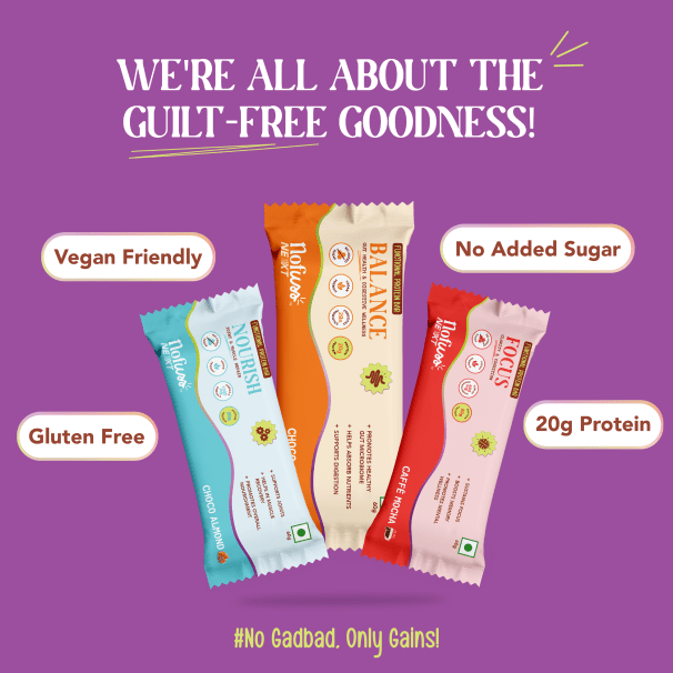
The protein bar packaging design for NoFuss is vibrant and functional, featuring bold typography and bright colour accents that make each variant easily distinguishable while clearly highlighting benefits like focus, nourishment, and balance. For the protein powders, the clean, modern layout combines rich colours with a wave-like graphic that adds energy, paired with concise, well-placed details to communicate quality and functionality at a glance. Both designs embody NoFuss’s energetic, inclusive, and straightforward branding.
Discover
In the discovery phase, we delved into NoFuss’s vision of creating an energetic, inclusive, and clean brand. We explored the functional nutrition space, studied market trends, and understood NoFuss’s commitment to quality and transparency. This research helped us uncover insights into their values and target audience, shaping the foundation of our design approach.
Define
During the definition phase, we transformed our findings into a clear and cohesive brand strategy. Collaborating with NoFuss, we developed visual and verbal guidelines that reflect their energetic and straightforward ethos. We defined the brand’s tone of voice, key messaging, and packaging framework to ensure clarity, trust, and a lasting impression across all touchpoints.
Design
In the design phase, we brought NoFuss’s identity to life through vibrant, modern packaging. Bright colours, bold typography, and clean layouts were used to create packaging that stands out while communicating key product benefits. The design balances energy with simplicity, making it approachable, inclusive, and reflective of the brand’s commitment to quality and transparency.
Amazon Creatives
We crafted visually engaging Amazon A+ listing creatives for NoFuss, combining vibrant visuals with compelling and concise copy. Each section was designed to highlight the brand’s key benefits, product features, and unique selling points in an easy-to-digest format. The result is a dynamic, scroll-stopping experience that captures attention and drives conversions.
Strategy & Creative Direction: Shriya Seshadri
Senior Graphic Designer: Esha Waghdhare
Graphic Designer: Tanisha Jain
Junior Graphic Designer: Khushi Pancholi, Aqsa Khan