
Natural Philosophy
NAP, founded in 2021, is a disruptive natural skincare brand offering simple yet effective Ayurvedic solutions. Their Australian-made products are all-natural, cruelty-free, paraben-free, sulfate-free, gender-neutral, and rooted in ancestral wisdom. Perfect for any occasion, NAP’s small-batch, versatile skincare ensures your skin will love you back.
We embraced their commitment to natural, ancestral skincare by crafting a visual identity that reflects simplicity and purity. The new packaging, inspired by earthy and clean tones, highlights NAP’s Australian roots and dedication to quality. Through our design, we aimed to enhance the customer experience, making each product feel like a luxurious yet accessible skincare essential.
Client
Natural Philosophy
Category
Skincare Brand
Re-Branding and
Packaging Design


Our Take on the Packaging
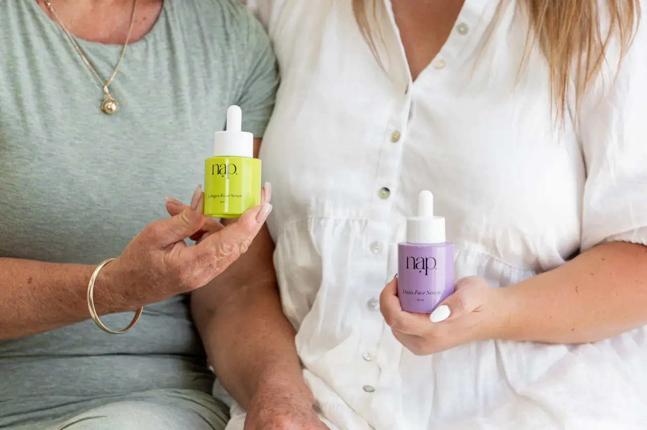
In designing NAP’s packaging, we infused a pop of color into the clean, minimalist aesthetic, capturing the essence of their all-natural, Ayurvedic skincare. The result is a vibrant yet sophisticated look that stands out on shelves, reflecting NAP’s commitment to simplicity and effectiveness. Each design element is carefully chosen to enhance the product’s appeal while maintaining a sleek, modern feel, ensuring that NAP’s packaging is both visually striking and true to its natural roots.


Discover
In the discovery phase, we delved into NAP’s brand philosophy, values, and market position. Through research and analysis, we gained insights into their target audience and unique qualities. This foundation allowed us to identify the core elements that would resonate with customers and guide our design process.
Define
During the definition phase, we translated our research insights into a clear brand strategy. Collaborating with NAP, we established visual and verbal identity guidelines, ensuring consistency in voice, tone, and messaging. This phase set the direction for creating packaging that reflects NAP’s core values.
Design
In the design phase, we brought the brand strategy to life with creative, vibrant, and minimalist packaging. Our team experimented with color palettes, typography, and materials to craft visually striking packaging that embodies NAP’s natural skincare ethos. The final design blends modern aesthetics with ancestral wisdom, enhancing customer appeal.


A successful rebrand
NAP’s rebranding was a resounding success, transforming the brand’s identity and market presence. By embracing simplicity and natural elements, we created a vibrant and minimalist design that resonated with their target audience. The new packaging, featuring clean lines and pops of color, effectively communicated NAP’s commitment to all-natural, high-quality skincare. This refreshed visual identity not only boosted brand recognition but also strengthened customer loyalty, positioning NAP as a standout in the natural skincare industry.

Strategy & Creative Direction: Shriya Seshadri
Senior Graphic Designer: Esha Waghdhare