Misfit
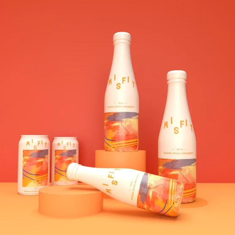
Misfit, a drinks/mixer brand, serves as a connector across diverse demographics with three distinct fruit flavors, each featuring unusual yet palatable fruit combinations.
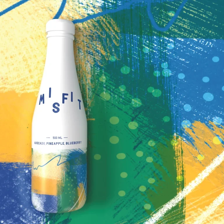
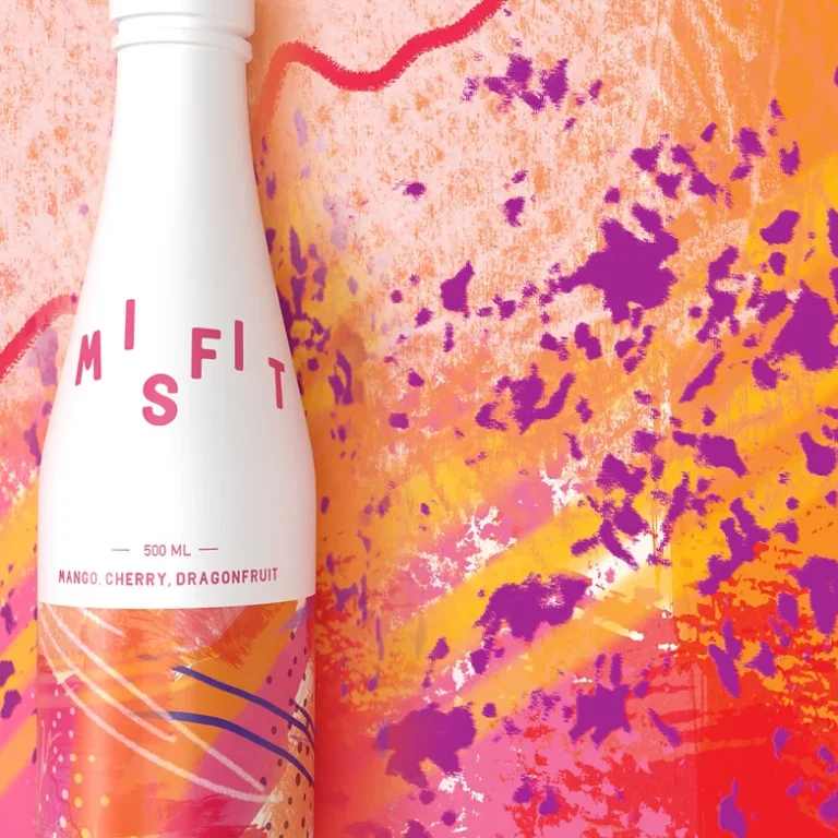
The branding & packaging centers on the theme of celebration and diversity. The packaging design for the cans and bottles reflects this concept through a combination of different colours, shapes, and textures, emphasizing the unique character of each flavour.
Client
Misfit
Category
Food & Beverages
Visual Identity, Branding & Packaging, Art Direction
Featured In
Pentawards, ADFPCDPLD



Our Take on the Branding & Packaging
The branding & packaging concept is a celebration of diversity, an ode to the beauty found in the unexpected – a canvas where different colours, shapes, and textures converge to create a symphony of uniqueness. That’s the packaging design for Misfit – a vibrant kaleidoscope that mirrors the variety within.
We went for abstract patterns to infuse an element of intrigue and unpredictability into the brand’s visual identity. It’s a nod to the “misfit” nature of the drink, standing out in its beautiful, unconventional way.
The logo is the embodiment of the name “Misfit.” Bold, distinct, and a little rebellious – just like the brand itself. So, when you see Misfit, you’re witnessing a visual journey that mirrors the celebration and diversity at the heart of the brand.
📦 Branding & Packaging





We crafted their coasters as well!
We extended the branding & packaging to craft distinctive coasters, incorporating key brand assets for a cohesive and memorable touch.


Strategy & Creative Direction: Shriya Seshadri
Lead Graphic Designer: Shriya Seshadri