

If you looked at wellness brands a decade ago, many of them looked remarkably similar. White packs, botanical illustrations, muted greens and clinical layouts became the category’s shorthand for credibility. Whether the product was Ayurvedic, clean beauty or nutritional, brands relied on the same visual cues because they signalled expertise. Today, that visual language is quietly changing.
What’s interesting is that newer brands still need to communicate trust, but they’re no longer relying on clinical aesthetics to do it. That raises an interesting question: if wellness brands look less clinical, why do they still feel trustworthy? The answer isn’t that trust has become less important. It’s that the way people build trust has changed.
Take The Whole Truth. The brand doesn’t ask consumers to trust it because it looks healthy. It earns trust through radical transparency, calling out ingredients on pack, breaking down nutrition myths on social media, and using founder-led communication to openly challenge industry practices. Transparency becomes the identity.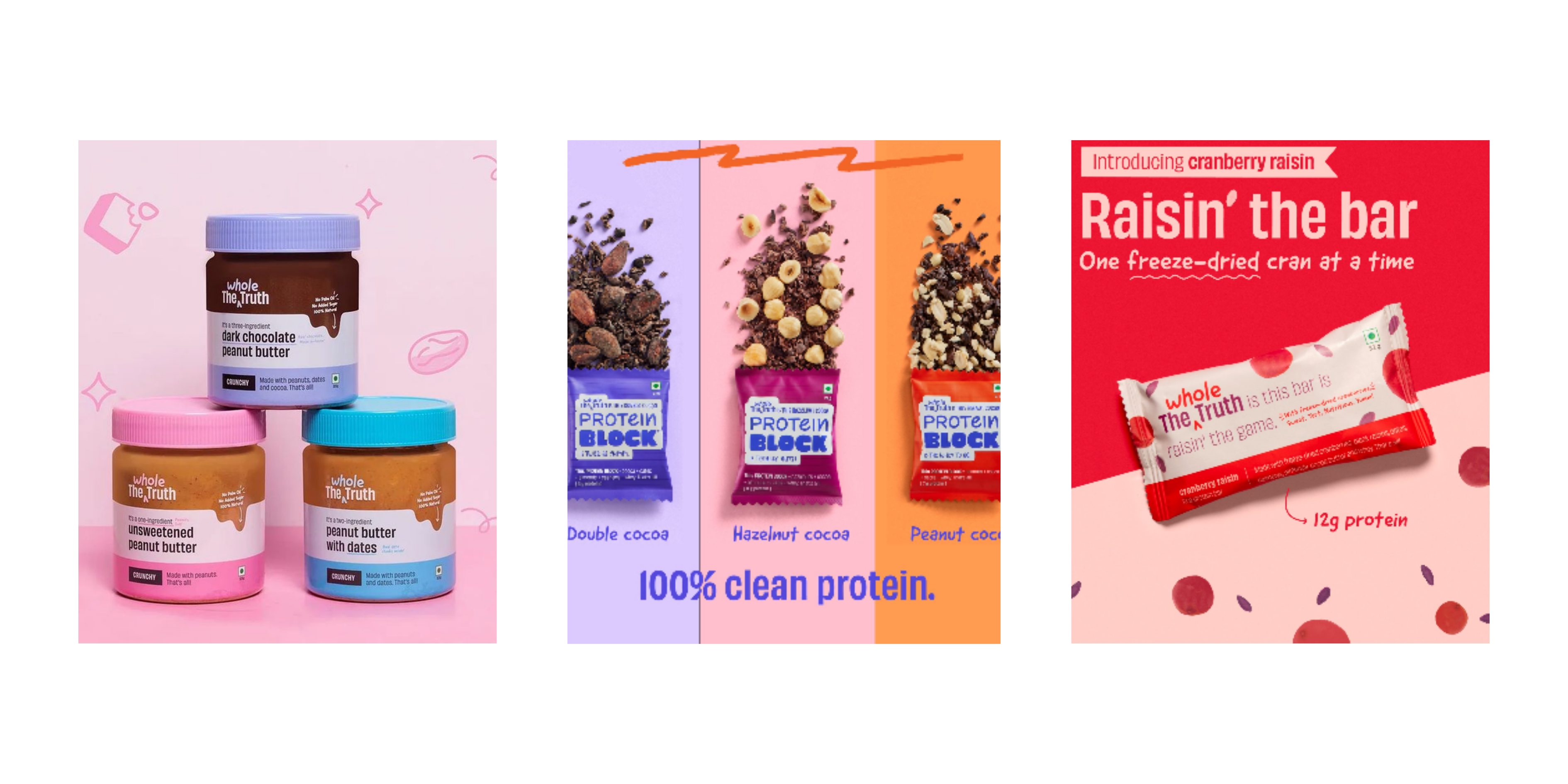 Image via The Whole Truth
Evolving Apes reframes wellness altogether. Instead of speaking to people trying to fix a problem, it speaks to those looking to improve their performance. Products are organised around states like focus, recovery and sleep, while phrases like “Unlock Peak Performance,” and “Unlock Your Best Self” position supplementation as a tool for self-improvement. The visual identity borrows more from performance and lifestyle culture than traditional wellness.
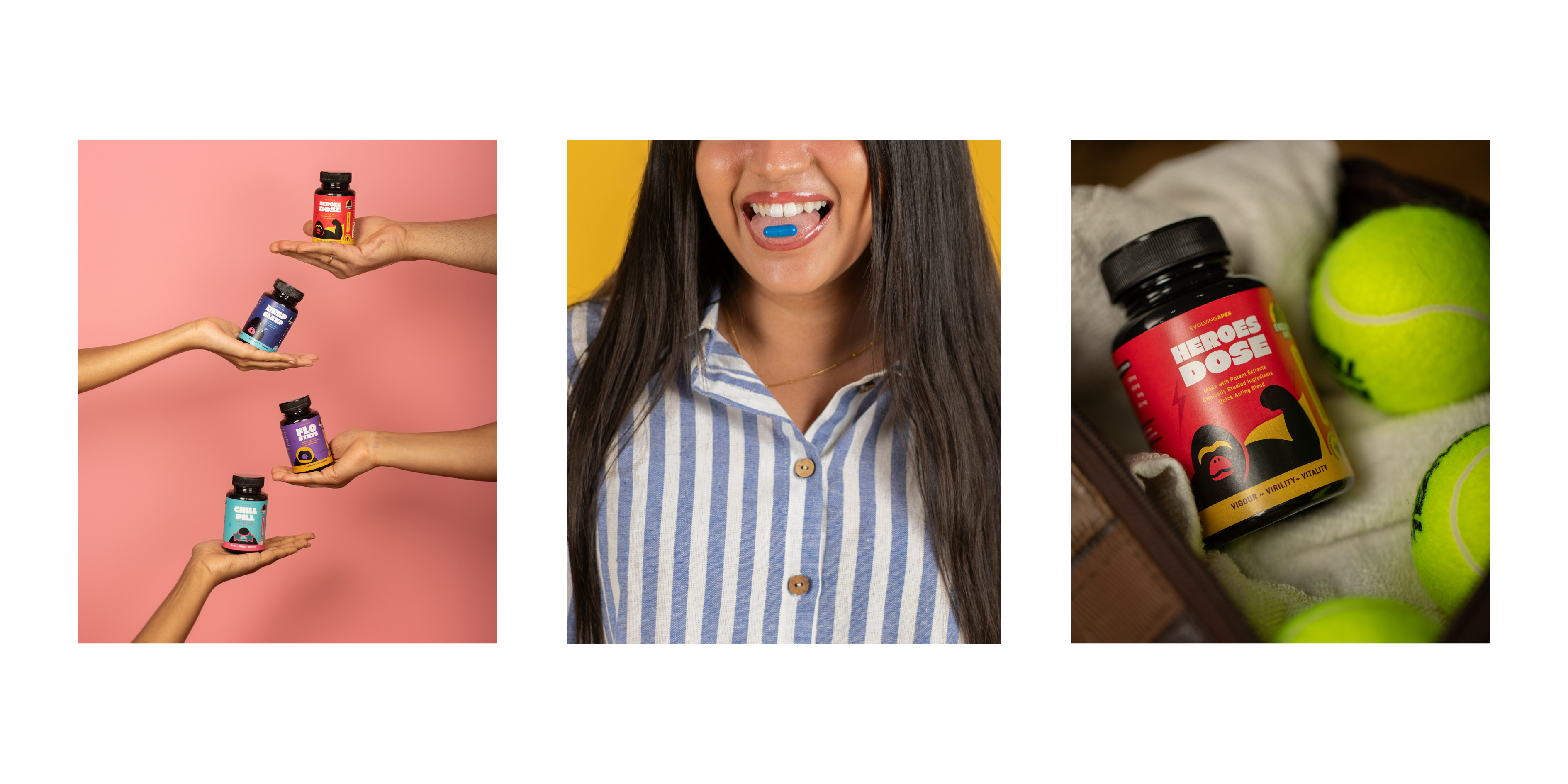 Image via Evolving Apes
Juicy Chemistry takes a softer approach. Rather than leading with scientific claims, it builds trust through ingredient stories, skincare rituals and editorial imagery that shows products as part of everyday life instead of isolated solutions.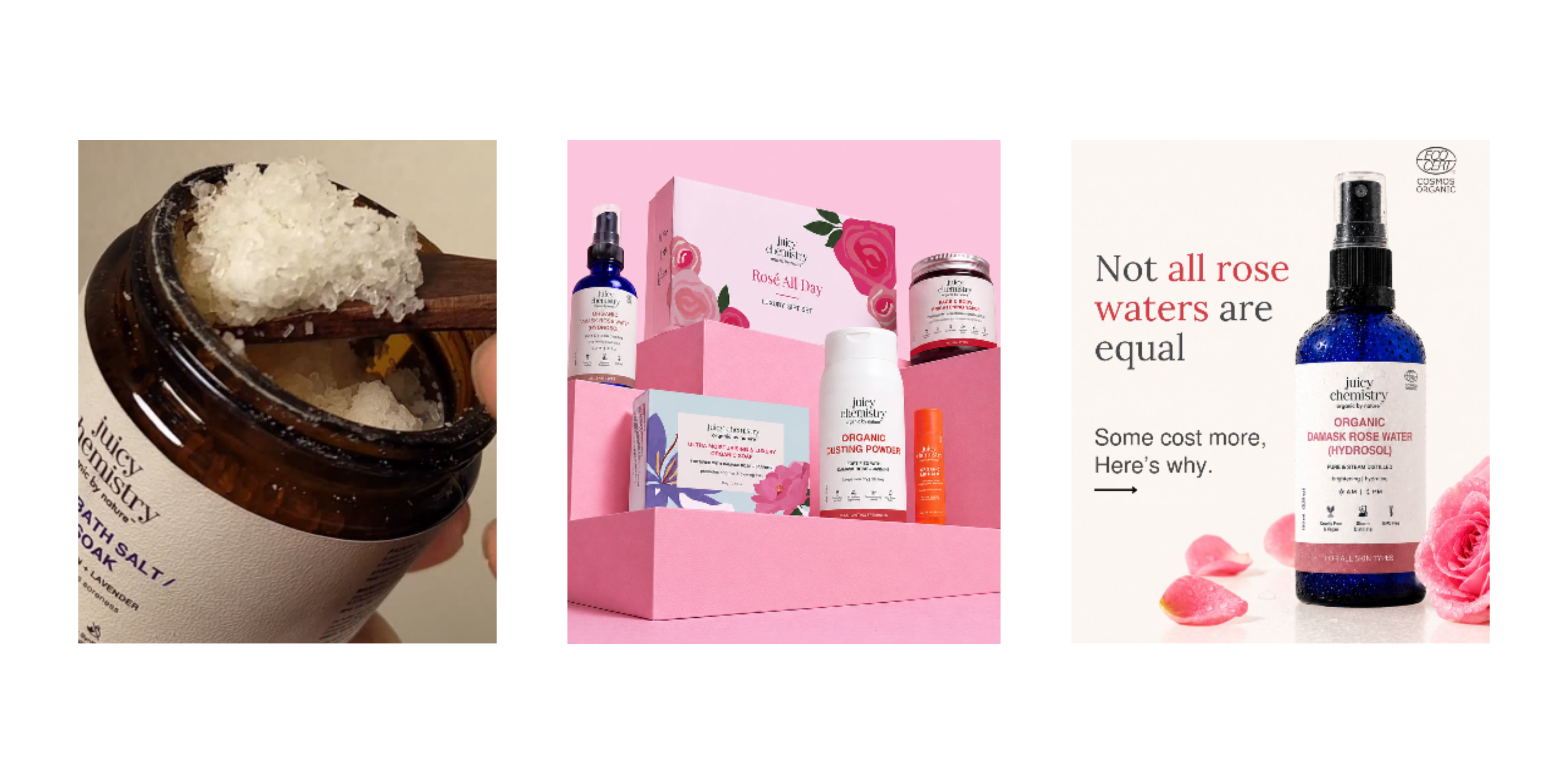 Image via Juicy Chemistry
The pattern across these brands is hard to ignore. Consumers no longer discover wellness products only on a retail shelf. They encounter them through Instagram reels, creator routines, ingredient explainers, reviews, and conversations. Trust is built gradually, long before the purchase. The design has evolved to reflect that behaviour. Packaging needs to work on a phone screen as much as it does in a store.
Perhaps that’s the bigger shift. The new visual language of Indian wellness isn’t really about colour palettes or typography. Those are simply the visible outcomes. What’s actually changing is the relationship between brands and consumers. Credibility is no longer communicated through authority alone. It’s built through transparency, participation and repeated evidence over time.