
Inskinn
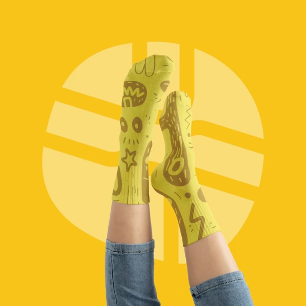
InSkinn is a fresh D2C brand on a mission to turn everyday sock shopping into something fun, expressive, and stylish. Built on convenience and curation, the brand transforms what was once a mundane purchase into an experience—offering unique, thoughtfully designed socks sourced from around the world. When InSkinn got us on board, their vision was clear: to build a bold, playful, and modern brand identity that sparks joy with every step.

Discover
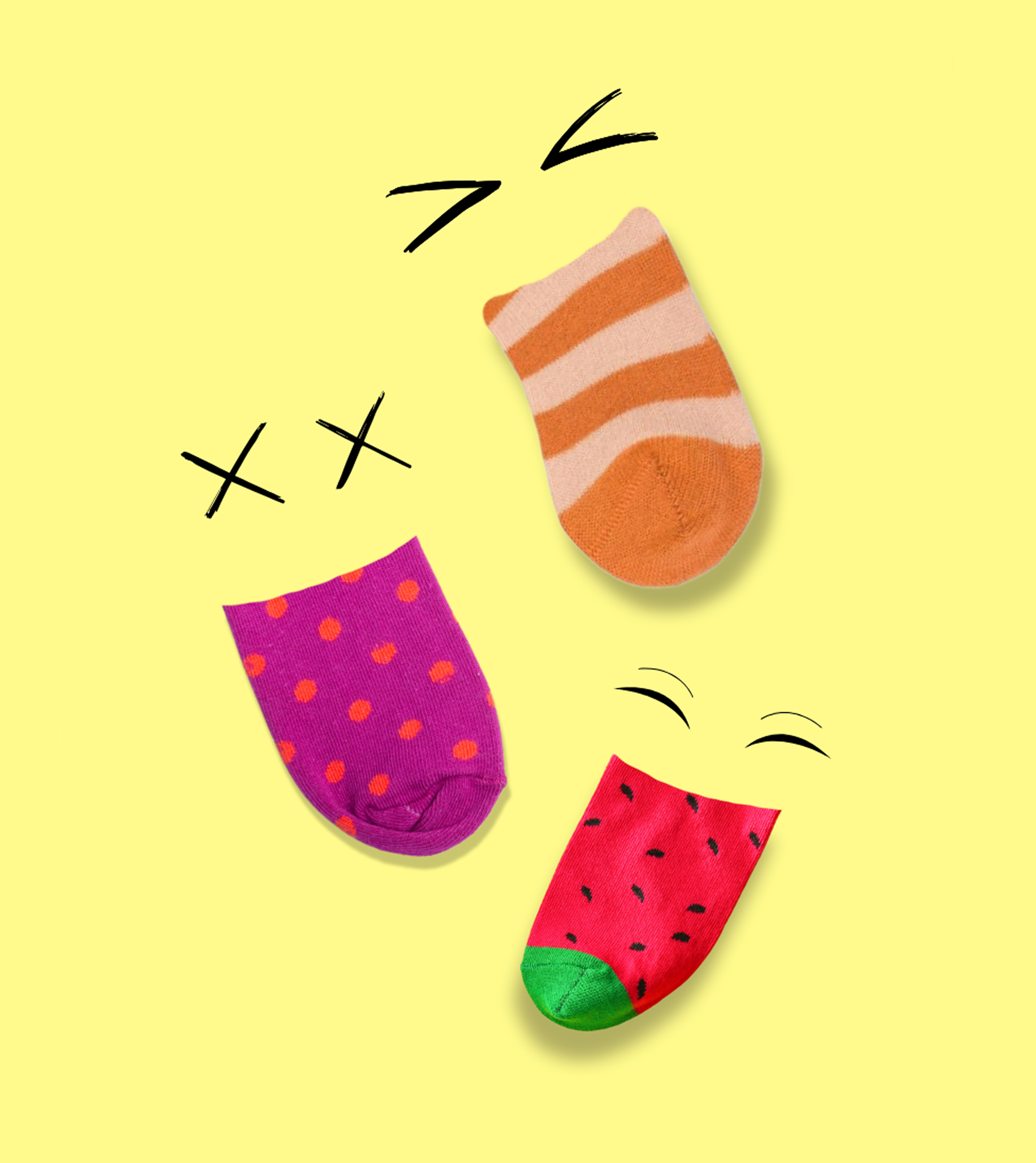
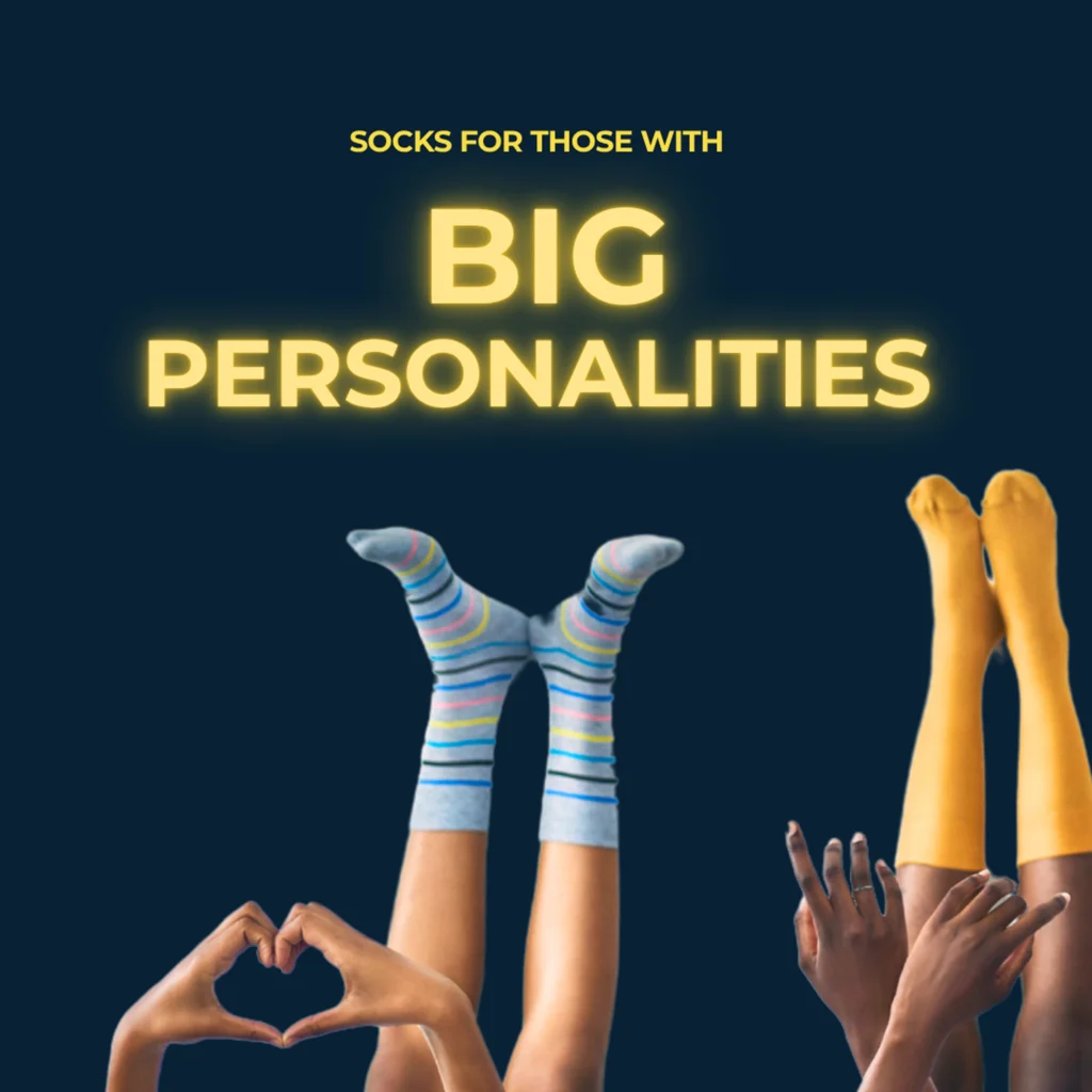
We began by immersing ourselves in InSkinn’s vision: a youthful, fun, and accessible brand that turns an everyday purchase into an exciting experience. Through brand exploration, we uncovered the values that would shape their identity —fun, friendly, stylish, and supportive.
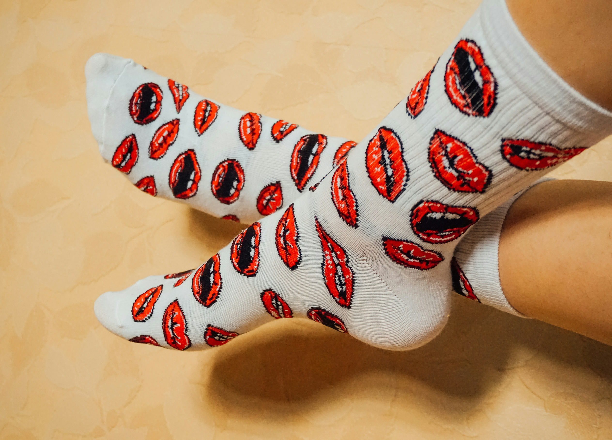
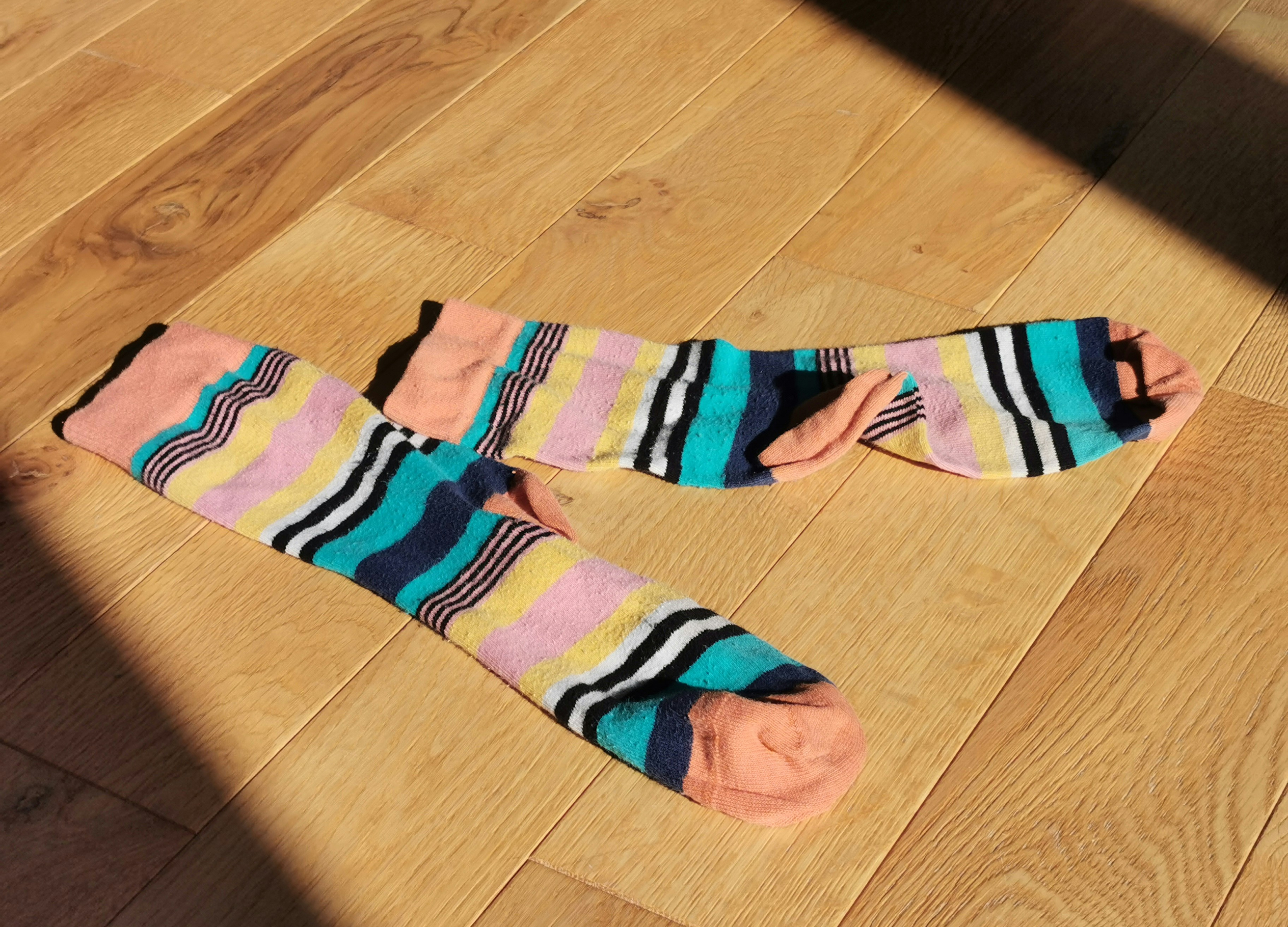
This discovery phase was about understanding more than just design aesthetics. It was about identifying the emotional cues socks could carry: joy, comfort, and self-expression.
Define
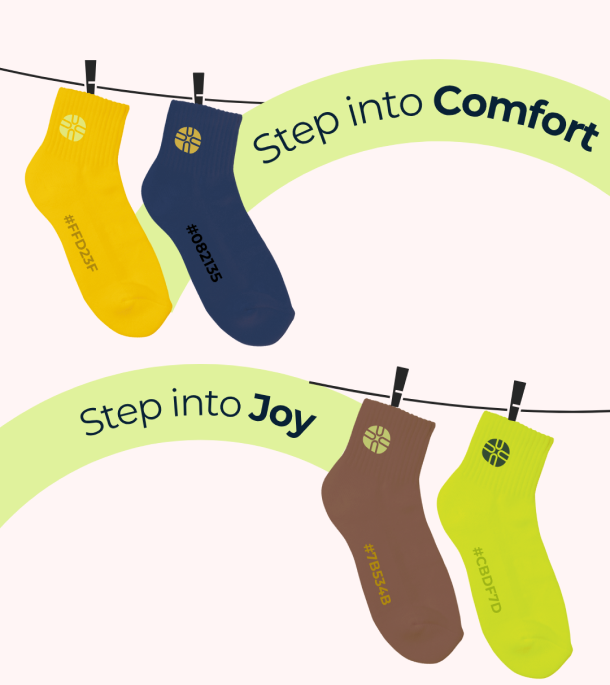
With insights from the discovery and brief, we established the brand foundation. We defined a tone that was playful yet modern, approachable yet confident. A bold word-mark paired with a distinct mark, complemented by bright and fresh tones for versatility.
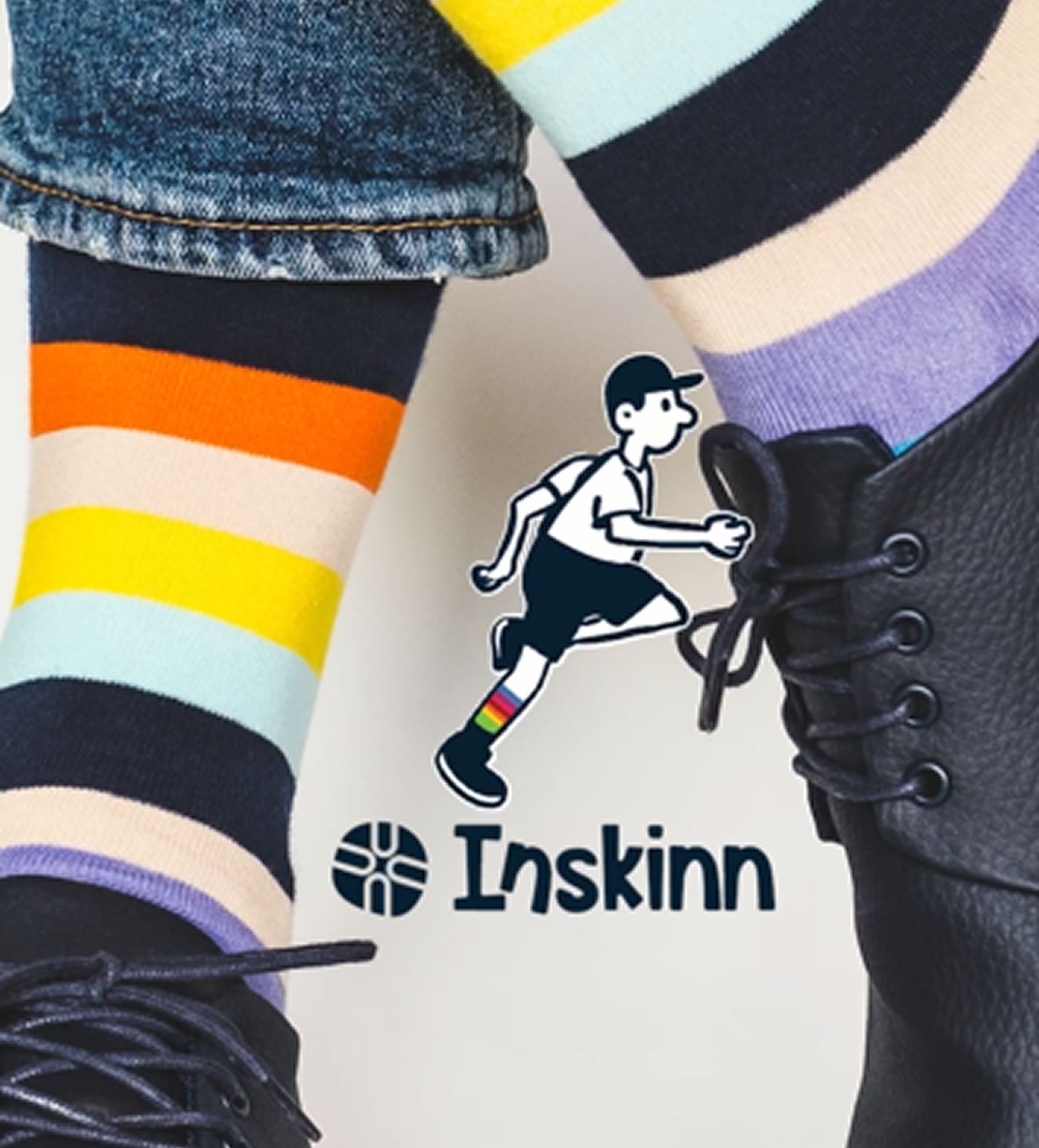
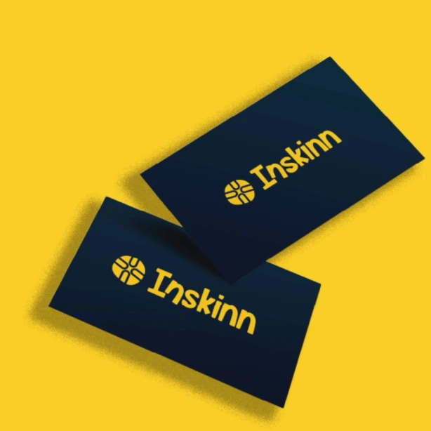
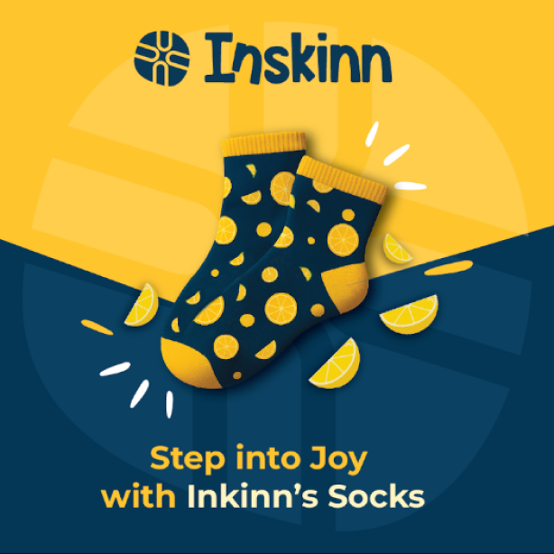
Our take on the Logo
The logo was designed to be bold, versatile, and instantly recognisable. With a clear, playful word mark and a distinct logo mark, it captures the lighthearted yet stylish nature of the brand. Guidelines around clear space, colour adaptability, and usage ensure consistency across all platforms—from digital screens to packaging labels.
We at Summer Owl Studio created a cohesive brand system for InSkinn, one that makes sock shopping exciting, stylish, and memorable. The identity doesn’t just elevate the brand visually; it ensures InSkinn stands out in the competitive D2C space as a bold, joyful disruptor.
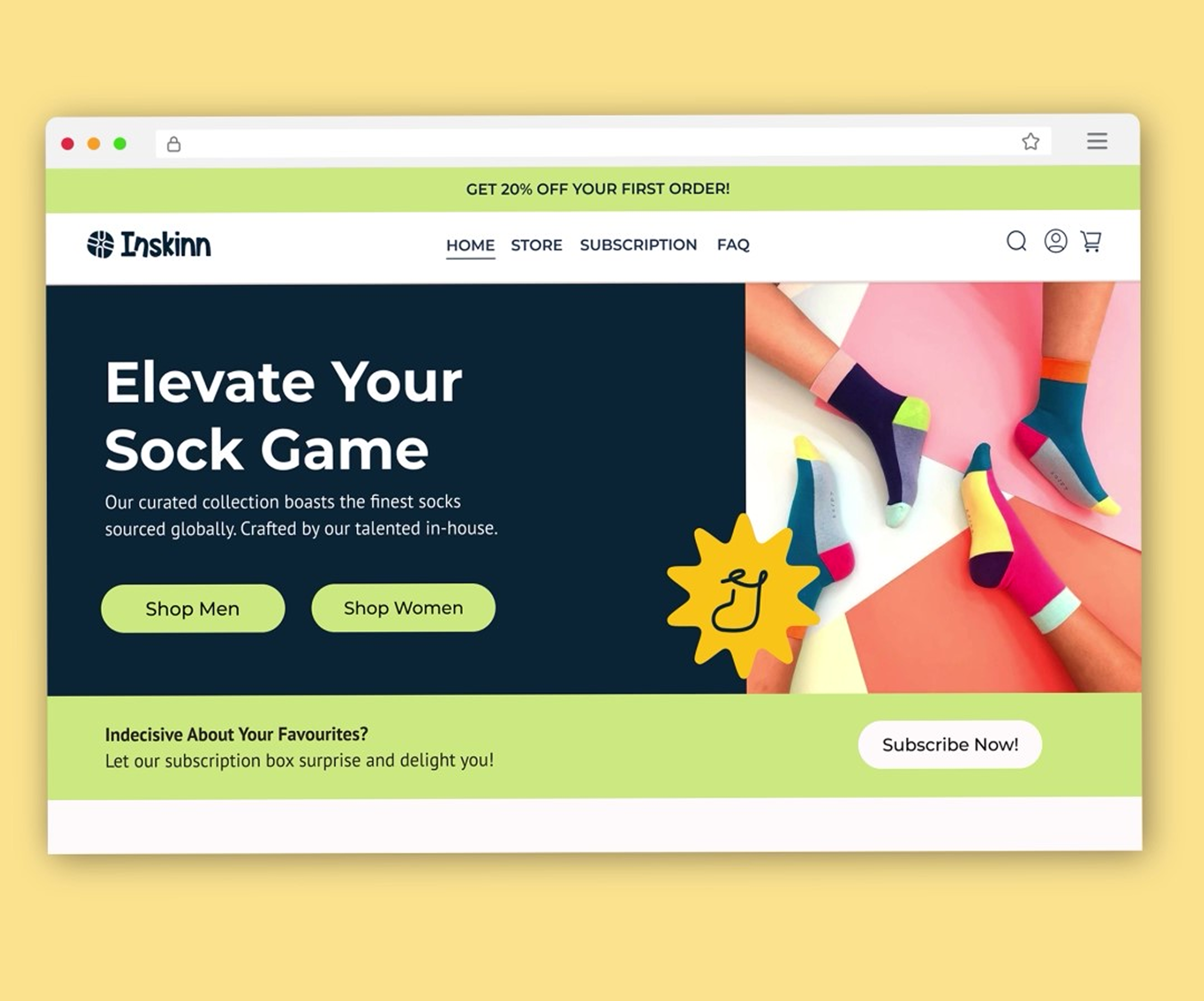
Our Take On Website
For InSkinn’s website, we strategised to create an experience as bold and seamless as their brand identity. The tone of voice was designed to be fun and high-energy, inviting customers to explore collections without friction. Easy categorisation was central to the UX, allowing customers to browse by styles such as Printed Socks, Plain Socks, Formal Socks, and even by length. To amplify repeat engagement, we introduced a subscription model for customers eager to access new collections as soon as they are released.
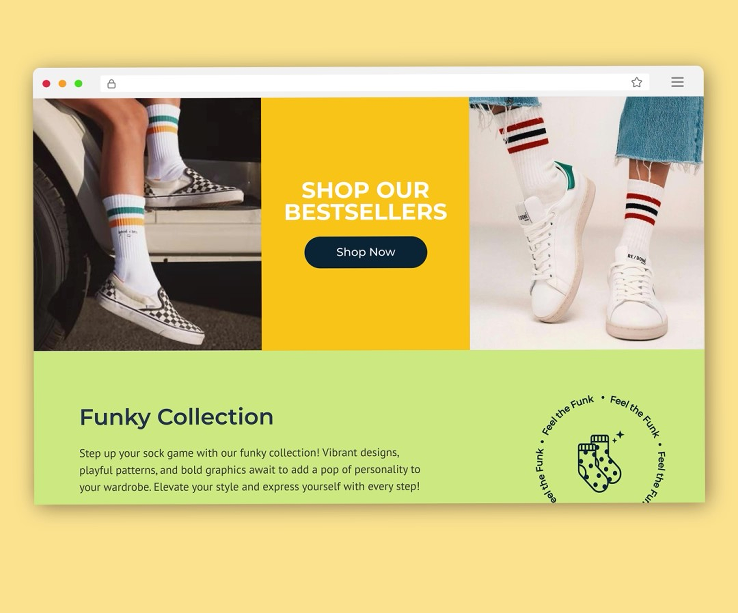
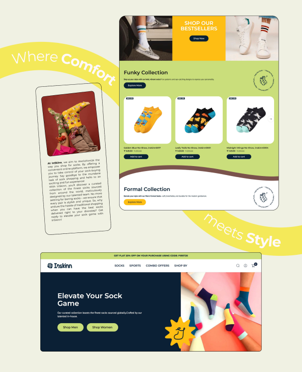
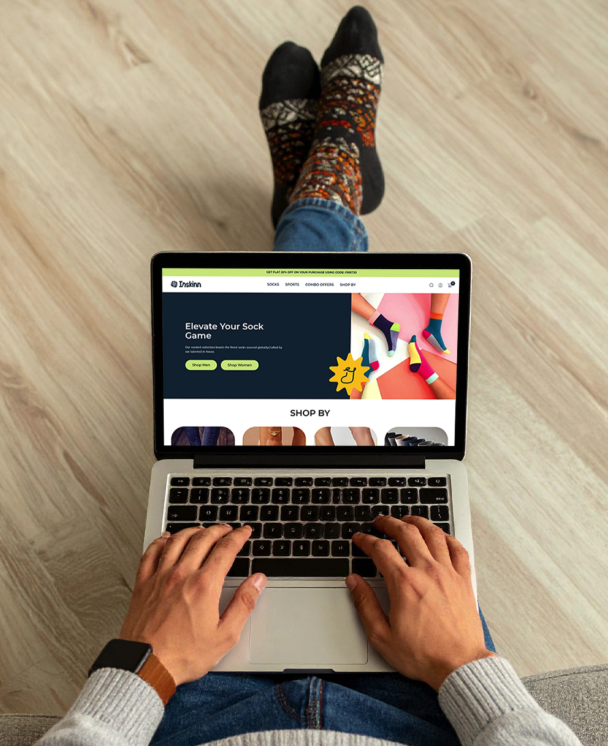
The design phase translated the strategy into tangible touch points. Every element, from the logo placement to the colour accents, was intentional, reinforcing InSkinn’s position as a disruptor in the socks world. Together, the visual identity didn’t just give InSkinn a look; we gave it a voice, a personality, and a presence that customers could connect with.
Strategy & Creative Direction: Shriya Seshadri
Lead Graphic Designer: Esha Waghdhare
Junior Graphic Designer: Khushi Pancholi